
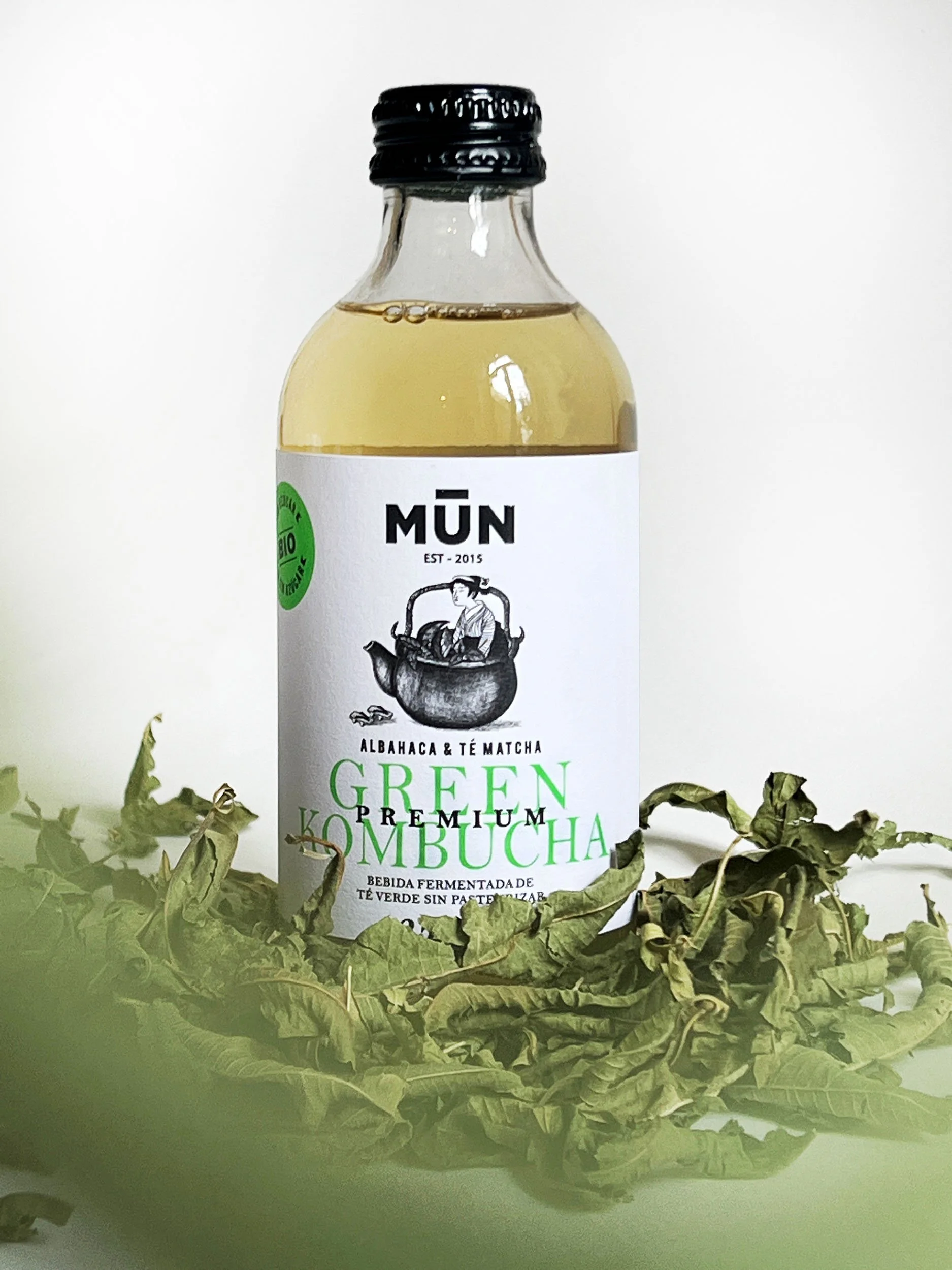
MUN Isotònic
New packaging line from the brand Mun Ferments for their products made with kombucha and seawater. Isotonic is designed for athletes of all levels as it helps to rehydrate and replenish the minerals lost through sweat and intense exercise.
We were asked to create a new label design for the isotonic drink line, one that is attractive and modern in style. The result is inspired by the relationship between images around seawater. It features a set of six labels, each with a different character, showing how each one interacts with the sea. A simple and elegant visual language contrasts with the shapes and colors of the graphics.
Industry
Packaging
Food&Beverage
Awards
LAUS, Bronce 2023
on Packagine

Client:
MUN Ferments
Creative & Art Direction:
Studio Regina Puig
Photographer:
Sergi Barjuan
share button


The Strategy
Our strategy involved highlighting the value of this product made with seawater. In collaboration with Mercè de Mun Kombucha on the copywriting, we designed a visual classification system for all Mun product categories: mass consumption and horeca, with their respective subcategories.
The classification needed to be visually clear and easy to understand. Most importantly, it had to reach the end consumer in an honest way.

Before
The Solution
We developed a series of six wraparound labels for each bottle, with each bottle featuring a character interacting with the sea and water.
Each label illustrated the story of a character—playing, relaxing, exercising, and so on...
Different photo montages were created to illustrate each concept. This innovative solution resulted in a collection of labels that not only offered literary appeal but also perfectly communicated the essence of seawater in every bottle.

We’re passionate about bringing your ideas to life with designs that truly connect and inspire.